Showing posts with label layout. Show all posts

Tuesday, June 25, 2013

The Return


Incomplete & Cropped
Lately I've focused incorporating flowers and metals into new projects.  I've struggled with flower placement as either sprays or decorative elements from the beginning.  Inexperience with metals came down to inventory resources.  In this latest layout I've had opportunity to work with both.  The flower spray in the lower left corner still seems imbalanced somehow.  Secondly, this flower arrangement is dead flat.  Since the layout is not intended for a book where depth is an issue, it feels instinctively wrong not creating opportunity for shadowing.  Perhaps not. Overall, not a bad attempt for my first attempt.

This year's vacation is a thoroughly documented historical event, still unscrapped. Time to get serious about pulling it all together and for all that I still haven't decided which paper collection to use.  I originally bought Farm House Fair Skies collection for this purpose, but fell in love with - and purchased - Prima's Craftsman; either will work fabulously for the project. Choosing between the two collections might be the most difficult decision of the entire project. 

There's been two substantial hauls in under a week. I'm too ashamed to admit how much money changed hands; but using a spender's rationale, it can be said I saved more than paid.  The new inventory overflows with all types of goodies, covering everything from alphas to zippers.  The multiple quests involved purchasing items I've wanted to experiment with and incorporate into creations, but haven't, being unwilling to spend full price for something that may, or may not benefit future creations.

That's all for now!

Wednesday, September 26, 2012

Productivity

Little Darlings Page Element
 I've decided the best approach to each page design is to treat each element going onto a page as a mini-mini page layout.  For example: one page cut out is backed with a coordinating paper, both the bottom paper and the cut out inked, lace applied to the back of the cutout image, and apply an even smaller element inked and Stickled.  A simple 2.5x3.5 image comes out as a 5.5x4.25 micro page consisting of six layers.  This doesn't count the four to seven layers the embellishment will be mounted upon. However, it turned out  looking rather professional, or at least pretty good.
__________________________

There was a special father-daughter soccer game this evening.  We brought along the camera to capture a few unique elements since this year's soccer album needed a few more photos  Everything went well until the very last moments of game play.  The star of the show was running full out chasing the ball before it went out of play.  Very close to this area was a mom also taking pictures of the game.  Predictably, it turned into a disaster.  Before anyone could take corrective action, Miss J ran into the lady on the ground.  Almost.  The lady had a small dog, leased, sitting directly in front of her, and it being fully conscious of the mayhem about to take place jumped up and attacked.  The Miss ended up with multiple and deep bite marks on her thigh and lower leg.  These quickly turned into a very ugly blue mixed with red blood.  I've never seen her cry over an injury before, but this incident caused large wet tears to well. 

Fortunately for all, the dog is fully vaccinated and current with all other required shots as well registered with the, but will still be sequestered in the pound for ten days due to asinine city policy .  What is wrong with that picture?  I was spitting mad that despite following all the rules the family has to be separated from the family pet, and to add insult to injury (so to speak), must pay impounding fees.  The lady was generous enough to allow a picture of the dog and its victim.  That will be a great page to scrap... when animals attack.

Tomorrow we run down to the doctor's office for a tetanus shot.  At any rate, the team won the game at 2-0.

Thursday, August 9, 2012

Scrap-lifted

This layout is one I virtually lifted from the page of another artist, NMscrapper.  The paper was on hand (or maybe I ordered the paper after seeing the original layout) and a store accidentally sent me the chipboard pieces - really! - and I immediately knew which photo belonged on my version.

Adaptation of original layout featuring my mother, 1953


Scraplifted from NMscrappy, posted on Scrapbook.com


I'll readily admit the original looks far better than mine.  (Better photography, to begin with!)  But the similarities are striking.

I was particularly proud of the pleated flowers I made from scratch... my first.  I recently bought a Cricut cartridge, Flower Shoppe, that handily allows me to create the yellow roses found on NMScrappy's page.  I'm still working with the cartridge, but this demonstrates the progression of skill acquisition over time.  Today, I would have copied the yellow roses and applied them to the LO.

I created this layout when cutting very pretty paper still seemed rather sinful.  I learned after this paper could and should be cut, which cracked the barrier that kept me from opening the virgin G45 stacks.  Although I loved the paper line, Printery, I didn't realize it came from Prima Marketing.  Had I, I probably never would have used it.  It's just good that it did.... plus, I still have more of the paper to hoarde.

Monday, June 25, 2012

Lots of Smiling

Well.


(With a huge grin on my face...)


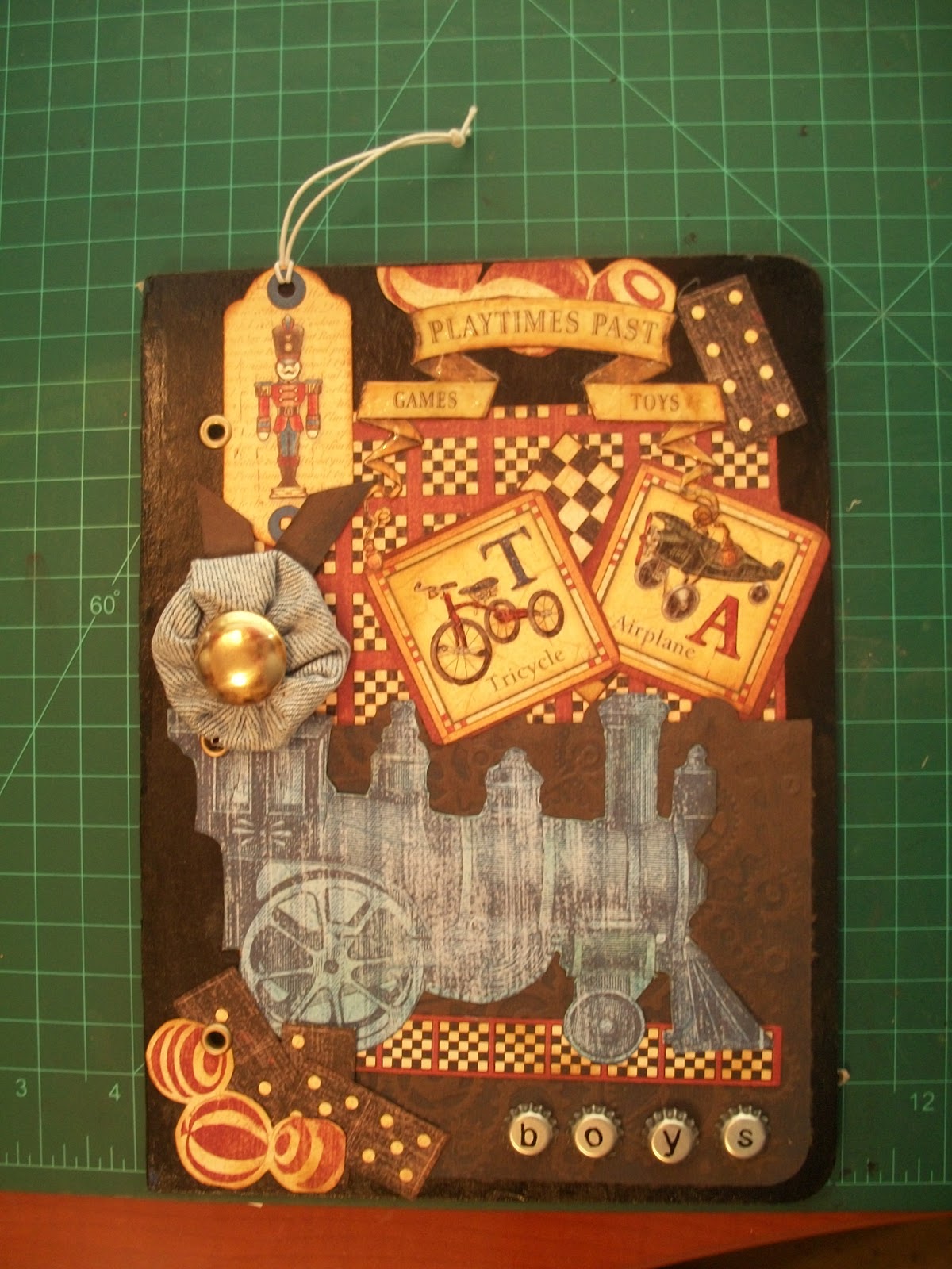
I did it!!!  I designed my very first mini-album cover.  And it ain't half bad. 

The Beginning


Of course, there's the back and everything else left to be done, but for most of that it's all laid out either on paper or in this rattling marble up here.  

I sound a little excited yet?  Oh, I am.  Everything I've created before this was fairly copied stitch by stitch, page by page.  At least in my case, this is the way it works.  So I've taken all the lessons learned thus far (many, many) and apply them to one of the most special items I'll ever own... beautifully presented photos of the wonders of life; childhood, raising children, love, babies, and everything special imaginable.  But this - this - is the first mini coming straight out of my heart, into my head, and preserved in paper for decades to come. 


Graphic 45 has several new lines of paper coming out to be revealed over the next few weeks.  Too early to buy, but not to early to slobber over, either.  I now possess the ABC Primer, Playtimes Past, Little Darlings, A Proper Gentleman, Communique, Botanicabelle, Fashionista, and most of the On the Boardwalk and Le Romantique lines.  I plan to get the latest Halloween Happy Haunting, and the newest - Nutcracker Sweet - lines in the next month or so.  G45 will release their other newest lines, so I'll probably want those as well.  Though I'll happily cut it, it's still enough to just flip through the papers and admire the colours and images.  So far as I'm concerned, it would take some really special type of paper pack to entice me into purchasing a different line.  

Who could resist working with Christmas scrapbooking pages such as these?


I, for one, can not and shall not resist at all.  Too bad I just finished the 2012 Christmas mini a couple of weeks ago!  Maybe for a Christmas past?  My fingers already itch.

Sunday, June 17, 2012

Fiskars

Fiskars, usually a very reliable brand, puts out a series of decorative photo corner punches.


These are the singularly absolute worst punches a person can own.  
  1. The buyer is left to guess how much mat allowance to properly fit the photo
  2. Getting the exact corner alignment is a matter of  hope, the guides are impossible to see
  3. The punch can not be turned over in order to remedy the second point
  4. It takes standing over the punch to depress the lever, which explains the third point

I own so many of their craft products, but I have to rate this one: 1 on a scale of 1 to 100


________________________________________


On a slightly different note, 2 of 4 layouts completed!

Yeah, the whole photography issue.

Boing, Boing, Busy

That whole stamping category process continues.  The first day I knocked out about 100 stamps, since then only a few packs at a time.  Slowly, but surely.  This will curb my appetite for large random stamp purchases.  (Boy, oh boy, what a meager set with such limited range, or so I know now going through the process!)

Today's focus was working with the Miss on a Father's Day card.  Her ability grows.

I've virtually copied and completed two different types of mini albums, step-by-step. It's a long-standing threat, but it's time to break away from the masters at YouTube and develop my own style.  And, in my fashion, design not one, but three, all at the same time.  

Graphic 45's Playtimes Past is a charming collection.  I don't mind cutting the paper any longer, but I only had a 12x12 inch pad.  Not so much room for error.  I found another 12x12 during one of the more recent excursions for only $7.00.  Mine! Now there's back up, not so much nail biting.  There's no getting around the fact that G45 fashions its lines with women in mind.  They do publish more masculine lines - and do a marvelous job - but even then many of the details scream feminine.  The Playtimes Past is a very fair mixture for both sexes.  I want the more masculine pages used for a carefully selected collection of my boys childhood pictures.  That leaves about 1/2 of the paper unused.  However!!  When I begin making pages for them, I can begin designing the feminine pages for my sister's girls; using the same page styles, but frilly it up a bit, more ribbon and sparkles, etc.  So two MA's for the work of one.  Not a bad idea.


The third will be a no-frills summer camp mini.  I've selected a Tim Holtz Retro Grunge paper pad for the project.  A little dark, perhaps, for a girl's summer album, but I'm sure this will fit her to a Tee.  I think to pattern this after the wallet-style just completed for this coming Christmas photos, with major modifications since we're only looking at less than 25 shots.

First though, I must pull together a couple (four or five) regular 12x12 layouts.  There's a very gratifying feeling when completing projects.  LO's only take a day or so and therefore seems as if I'm accomplishing much more than when compiling a single mini.  Perspective. 


In less than 10 minutes I pulled together the first LO.  Add paper and embellishments, and it's a done deal.


Our only snow 2012


Wednesday, June 6, 2012

Persistence

Persistence pays, but oh boy at what a cost!! 

I've decided mini-albums fit our lifestyle better than the 12x12 inch layouts.  Everything has a place and purpose, so I'll never totally abandon the larger version; perhaps the "best of the very best" annual album, or something along those lines.  From now on, most of my creative energy will go into the mini's.

With that thought in mind, I've come to the solid conviction made-from-scratch mini's are probably best left to professionals. I hate, (scorn, despise, revolt, etc) putting out inferior products.  There are allowances for skills not yet mastered, but not by much.  There has to be an exponential learning curve to scrapbooking skills, but more rational people would try to master one before going on to the next.  Not I, heavens no!  I want to master it all in one horse pill sized, gagging swallow.  


If there's a mistake to be made, almost corrected, and the same mistake made again, I'll do it every time; hands down.  Subsequently, a weekend project for most will take the weekend and the following week - and that's if I'm lucky.  It can be so very discouraging.  Fortunately, persistence runs in my DNA or this hobby would have been abandoned months ago.


At present I'm learning everything possible about book binding.  There are as many techniques as skilled crafters out there, but a couple of methods keep popping up as the most reasonable and flexible.  Maybe, if I can calm my butt down, I'll get reasonable skilled at this.  But not today.  Oh, no, not when this skill was critical to the project.  In common fashion, I'll have to put the project aside for a few days and practice this new skill until proficient.  That's why the weekend project takes ten or more days to complete.  Every project taken on has a whole new area of discovery, and learning.


On a more positive note, I've mastered a few skills; which makes a significant advancement for timely project completion.  (Down from three weeks to ten days.)


I've discussed adhesives before.  It comes as a surprise to learn there's more to learn.  When using the highest quality adhesives, there are tricks to make a tighter bond.  Burnishing goes a very long with with tape adhesives, and the brayer does a great job with wet glues.  The demands on adhesives are taken to new heights with all the moving and swing parts of the mini.  This was yet another hard learned lesson.


It's no secret I'm totally smitten with Graphic 45 papers.  I kept running into BoBunny projects and couldn't resist picking up a pack at one of my last hauls.  The colours are very soothing and even the brighter packs have a subtle tinting.  I simply can't wait to tear into this first package!  Someone special on my list will receive a very, very nice Christmas present this year.


It's possible I forget to post the adapted shoe organizer photo.

Most stamps & some punches


Just for kicks I decided to begin hanging some of my favourite embellishments on the 6x2 cork board running along the desks back panel.  I've only just started, but it's way too cute not to share.


Embellishments!


Sunday, May 20, 2012

Pop In

Just popping in to post a down and dirty picture of the newest LO, finished today.  It bears noting the design was inspired by a great artist at scrapbooking.com.

My mother, c. 1953

Hoping for a better photo with better lighting and space

Tuesday, April 17, 2012

Cricut Mat Rescue The One That WORKS

I've watched way, way too many YouTube videos talking about the best method for removing the yunk off a a less-then-sticky Cricut cutting mats.  There always seem to be many arduous steps involved in the process, not to mention extreme commitment of time.  Some claim these steps are easy... anyone could do them with great results.  Well, I've tried all the methods and they all involve WORK!

Have I ever mentioned how handy my husband comes in at the oddest moments? He stood back and watched yet another promised technique utterly fail.  He walked out of the room and came back in with a bottle of of GOO GONE, and said, "try this."  I did.

I generously sprayed the mat and let it sit for a minute.  I took paper towels to remove almost all the oogie-gooy glue and tiny bits of paper scraps .  I re-sprayed the mat, and one more wipe produced a virgin mat... except for all too-deep cuts.  No kidding, this took less than five minutes, start to finish.  I washed they mat with dish washing soap and hung it to dry; ready to spay adhesive.

After cleaning the first set of mats - well overused by this time - using this method, subsequent cleanings became a breeze.

Some might panic and say, this harsh chemical will harm the mats.  I've now processed each mat four times, and nothing gets harmed... and cleaner much quicker

______________________________________________

Successfully completed the pastel-based ocean page.  Thus far, I've only captured a fair representation, but it's not worth submitting anywhere but here.


Sunday, April 15, 2012

Page Theme Issues

I'm still studying differences between good, great, and wow-za pages.  And learned a couple of things today.

When putting together a page I pull out all the possible paper combinations, dies, stickers, stamps, etc I expect to use, or possibly use.  Without exception, one element will capture my fancy and, wrong as it is, I'll walk on hot coals to incorporate it.

I'll use the project currently under construction to demonstrate this point.

The page features a trip to the ocean.  The colour scheme runs to pastels.  I also wanted to blend shabby chic with just a bit of whimsey.  (Probably my first mistake)  The element I fell head over heels in love with was a couple of starfish cut from a die, and stamped with a truly adorable face.

Blurry, but a fair representation for this purpose

Cute as buttons.  So far, no problem with page assembly.  The starfish works well with the photo matting demonstrated in the photo.  There are two photos featured that go on the page, one each for the right and left side.  I set waves consisting of four layers of papers to create a bottom border for the page. (I cut and chalked a few fishes to appear to be jumping in and out of the waves.  Darling!)  The title will go in the upper right hand corner, and I plan to use three separate journaling boxes between the space of the two photos.  So far, all works together very nicely...

But this is where this "hooked on an element" becomes a problem.  I need "something" that binds the two pictures, and creates another layer of depth for the journaling boxes; perhaps a large strip of paper, 12x4 inches.  When I laid the thick mid-line border across the page, I got "blah."  I then began playing with one of the Tim Holtz masks picked up the other day.  Love at first sight.  That was the answer!!  Except it wasn't.  The chalked image creates a very formal setting.  Not at all within the theme, nothing whimsical about it; however, I really, really want to use it.

A much smaller image than the mask I would use, but it's easy to see the formality.


So that's a huge chunk of my problem... choosing two non-complimentary elements to a page.  I usually justify using both and calling it "mixed," but it's not.  It just proves my lack of experience.  Maybe someone with much more experience could pull it off, but I can't with goodly results.

Since I'm more than three-quarters finished with the page, it will have to be the flourish to go.  This will be a first.  It's a start in the right direction, however.

For now on I plan the page theme and keep cute away from formal.  It can't hurt!

Monday, April 9, 2012

Table, Organization & Tricky Deals

There's no comparison between my crafting table "during" the creation of a LO and the rare times when I'm not.  One looks as if a slow motion explosion has taken place, and the other a nice orderly oasis of quiet.  Without exception, and from a hard earned lesson, the table gets cleaned in between projects.  I've said it a hundred times already, but I can't think with a disorganized mess in the line of site.  I can't!  In the future I'll have to make sure any haul mention will be during those times between projects.  I want to start photographing/videoing them... for future reference.  And that simply can't be done on a disorganized table.

I find that once again there are more scrap room organizational changes necessary.  It's the paper!  There's a small box sitting on the floor layered with colour coordinated long paper strips.  There's no other place to file them neatly as they come in varying widths and lengths.  I'm thinking the solution to this could involve using the shoe tree bag currently used for punches; but then, what with all the punches?

Pink Shoe Bag, very weighted down

This, too, has become problematic lately since it's very difficult to find a particular punch within the current system.  Punches don't file into neat categories, be that size or theme.  The card ring with punched images is the only way of really knowing what I have available anymore.  That's a real lifesaver.  But most of the punches proper are heavy and restrict some options.  Maybe....?  We have a few open-wire baskets, primarily used with wire shelving systems out in the garage.  (Always a treasure trove of storage possibilities!!!)  I'm thinking using these at the back and hanging under of my craft table where they have both the weight and extra area to spread them out instead of riffling through small sleeves as required now.  Each time I wanted a punch it would require bending over and crawling under the table; bothersome, but "do-able" until I come up with a better system, and to a certain extent, I'm already doing with the current system.  The only other option would be to hang the other six-foot wire rack (the twin to the rack shown here) somewhere within the room.  And, as these things go, doing so would require rearranging that area, also.  Either way, something has to give somewhere.

The craft room was originally set up as the computer room.  I hadn't actually began scrapping at that point.  But, should we move again, the room would be set up specifically as a craft room, alleviating most of the organizational challenges dealt with over the past year.  One thing for certain... that computer desk with hutch would never grace the room!  I would certainly buy another crafting table instead.  And paint the room in pink and lime green, if I want.

____________________________________________

I submitted the latest LO for the CSI challenge with only hours to spare, and then only after I decided to settle with the photography results on hand, which were all less than idealistic.  Before this project, I never, in a million years, would have never considered the tricky problems with photographing a matte finished photo with a glossy.  Well, I sure do now!  I'm convinced that it can't be done.  Oh, sure, hundreds of photographers would testify to the contrary.  But not with MY skill set!  I literally spent almost two hours, some with Martin's help, trying to capture a true page likeness.  In every case it became a contest of shadows.  Even though I had two different skies to work with - 1 sunny and 1 rainy - and an abundance of natural and artificial light sources, there was no coaxing out a single great photo.  I guess the lesson taken from the experience is to consider this problem when thinking of using two different photo surfaces in the future.

The problematic glossy photo!  Urg!


All the myriad of talents learned thus far are about to be put to a functional use.  My husband went on a new diabetic medication delivery program.  It's not insulin, but he has to administer a shot within an hour of eating dinner, never after.  He does well with the morning shot, but 9 times of 10, he forgets the evening dose.  I'm about to put together a 6x6 or 8x8 cutely decorated page to remind him each evening.  It will say something to the effect of:  No pot before the shot, or some other silly thin.  I can't wait to jump on this project.  Just right after I pull together an awesomely adorable ocean themed LO.  ;D


Thursday, April 5, 2012

Latest LO

The LO mentioned last post is now 99.9% complete.  There's a journaling note required completely forgotten about.  I think it looks tacky, but may be able to correct it with some glitter in the morning.  (This tag will be removed before framing the page.)  The only other item left to attend involves good sunlight, camera and tripod.  I'll edit this post to include the photo after a satisfactory picture is cropped and sharpened.

This LO has much more white space than I'm accustomed to allowing, but in doing so I've allowed the eye to draw to the ares that were most important, or important as I saw it.

The photo of Martin and I used on the page is one of my all-time favourites!!  There's a little bit of silliness, and a whole lot of adoration caught at the most perfect moment.  I knew this would be the first photograph of the both of us to scrap when the right combination of time, inspiration and motivation hit.  And it did. 

It probably gets old, but I'm proud of the display.  I take pride in all the LO's done, but some don't have the same ooomph that rare others do.  This is one that gets framed and posted in our bedroom, along with the birthday "card" page completed last November.  Finally!  Some "art" for the room.  (Term used loosely.)

Even though decorating the coloured pencil bucket was a little over the top, I am proud of it.  Tonight while perusing YouTube, I found several videos featuring decked-out ATG guns.  Some looked professional, some looked as if they graduated 1st grade colouring class and never advanced from there.  It's theirs, and as long as they take pride in it, that's all that matters.  So now I'm thinking... given some down time, it might just be worth the effort to follow suit.  No doubt whatever I do will end up looking like the 1st grade child that failed that colouring class.  LOL.

Next week I hope to knock out three or four "everyday" scrapbook pages.  There's currently two semi-assembled pages featuring Johnna and her quirky ideas of scrap worthy events.  One involves all the not-so-major scraps, bruises, and rashes she proudly displayed for the camera, and the other concerns her foot and hand prints at age ten.  (Actually I thought of it, and she jumped at the notion.)  Also thought upon, but as yet began, are the 2012 snow photos and a few more pages from this past Christmas.

Tuesday, April 3, 2012

Colour Combo

I enjoy the challenges presented by CSI.  The entire point of the site is to encourage the scrapper to use five colour combinations normally not easily put to work together.  As so it is this week, also.  Another feature of the weekly challenges is incorporating shapes, elements or themes, often together.  And not least of all, journaling is part of the creation; this isn't a problem for me as I try to always journal about the subject or event represented.

This week they assembled a colour chart of a mustard, two tones of taupe, one green, and a sky blue.  I had no problem pulling all the colours from on-hand papers and putting them together in an attractive manner, but when I tried to use the blue as a background colour it clashed to high heavens.  The colours behind the heart photo are the actual colour combinations for this week.

Since there's no requisite size of the colours, they can be nothing more than accent pieces, or completely dominate the page... so long as it's there, it's all good.

I got very, very sneaky.  I glued sky blue gemstones to the cut out hearts I made for the project.  And though the gemstones in the second picture are not set yet, I managed to pull the blue up to the upper portion of the page.  (What a beautiful picture of Martin and me!)


There are times when I have to think outside the box.  It's very easy to slip into one style of layout, using the same materials and colours.  I don't think this would have ever come to mind had I not been challenged to fit together elements not normally used, but sure am glad that I did.

Friday, March 23, 2012

Ca-rot Top

I've been wanting to scrap this page for a long time now.  The only problem is the quality of the picture.  The back lighting from the bathroom window probably caused the extreme shading of the photo.  This is really disappointing, but was done before I began working on my photography "skills."  Don't think the same mistake would be made today, or at least would hope not.

The page is about a silly idea we came up with after cutting the top of a carrot that had greenery left in place.  The thought was that if we planted it, we would have a nice carrot at then end.  It got really bushy and healthy looking for about 2 months, but suddenly wilted.  The time was right for my helper to harvest.  After a hefty tug, all that came up was a green bunch of wilted leaves.  No carrot.  No roots.  The whole episode turned into a very fun memory... hence the desire to document the event despite the lousy photo.

Entering contests on CSI.com's site has opened me up to using colours in a way I might not have thought before.  I still lack real courage, but this is a learning process! 

About six months ago I stumbled upon an adorable pet-themed paper pack on sale.  The pages were absolutely adorable, but until this project I had no clue where to use the paper.  Now unleashed, there's many, many projects that come to mind using this paper.  This is how it goes with most all the paper pads bought along the way. As a side note... although the camera doesn't capture it, the rabbit is actually flocked.

I created the flower and carrot sign for embellishments.  The banner in the top right and the title located at the top left are commercial products.  The carrots are the crowning achievement on this page.  I used the Cricut to cut the shape, but the paper I wanted to use wasn't large enough to accommodate the full shape I had to start with, so in the end had to trace and manually cut the actual cutout onto paper originally planned for use; all done with very satisfactory results.  I then generously inked the carrots and leaves, and if I don't say so myself, did an excellent job on shading.


My Carrot Job


The most demanding aspect in presenting scrapped pages into digital images is capturing the true colours.  For that, I'm still experimenting with lighting techniques.  Too much light and the photo turns out washed; too little and all is dimmed (as in this case).  I believe setting up a shoot in diffused sunlight works best.  I may have found the solution for taking perfectly square photos for cropping.  There is an adapter to the tripod that extends an arm that in turn holds the camera directly over the center of the subject.  The centering is most critical for cropping; any deviation in angle distorts captured lines.  These devices run anywhere between $35-60, but Martin thinks he can build one for under $10.  The question at that point is when he'll have time to get to do it.  I'll give him two months after the promise, but if there are no results, it's off to the store for the extension bar.


Saturday, March 3, 2012

Taking it Up a Notch

I've made the leap!  I actually entered a scrapbook page contest at http://csicolorstoriesinspiration.ning.com/main/embeddable/list, Case #8.  Not sure when the winners will be announced, but I think sometime this next week.

To complete the project, I used many of the techniques picked up along the way including:design, story telling, die cutting, Cricut Expression cutting (the goalie glove... got it right the 1st time for the 1st time ever!), matting, inking, stitching, stamping, and adding personally created embellishments.  It's hard believing the list isn't a comprehensive list of techniques picked up along the way.

One of my proudest achievements for this projects was working under a strict time-line. 

Even should I warrant an honourable mention, that would be enough for a first contest attempt.  There's no real prize for placement in the contest save for recognition and bragging rights. 
So this is my entry for all it's worth:

Pure Star Power, documents 1st soccer tournament


Friday, February 24, 2012

Shock and Awww!

There's still an itch to get back to scrapbooking, and yet I simply can't find the inspiration to actually sit down and do the deed.  I miss this stuff!

The Kiwi Lane Design templates arrived.  That should be enough to cause immediate breaking down of doors and pulling out the drawers and get down to scrappin'; alas, not quite yet.  For reference, I purchased the bracket and scallop 12 in sets.  They are adorable.

I found an online scrapbook store called Blue Moon Scrapbooking.  They may not be the largest store out there, and they are large, but what they have are collections and items fairly unique, and on the pricier side.  (Okay, I consider anything over $10 an item is on the pricier side!)

While perusing there last night I fell head over heels in love with a new Graphic 45 collection called Little Darlings, an infancy paper theme with 1920-30's colour schemes.  I showed Martin the collection and he absolutely looked aghast.  "Angel, how would you EVER use this paper?  It's too pretty to cut and some of the pages are works of art in their own right!"  Yep, his first exposure to Graphic 45 scrapbook paper.

The following scrapbook page is one of the very first done and is one in a series of three.  And yes, I'm still working to perfect the photographing of scrapbook pages.